COMPETITOR ANALYSIS • USER RESEARCH • DESIGN SYSTEM • PRODUCT DESIGN
Designing a Frictionless Gateway for Corporate Enrollment
We streamlined policy onboarding, showcasing policy benefits that user can enrol into along with their basis group medical cover.
Time
2 months
Role
Product Designer
Collaborations
Co Founder, Product Manager, Developers

Context
Visit Health provides critical OPD benefits to partnered policyholders, which they onboard through our enrollment portal but our legacy portal acted as a friction point rather than a gateway. A lack of self-serve information led to an unsustainable dependency on Relationship Managers, causing significant onboarding delays. On the backend, a lack of modularity meant that unique policy customizations were driving up development debt and slowing down our go-to-market speed.
Problem
The objective was to transform a high-friction enrollment process into a self-governing journey. I needed to architect a system that provided total policy transparency for the user while maintaining a modular backend. This allowed us to stay 'brand-agile'—ensuring the portal could be instantly tailored to diverse corporate requirements without requiring custom code for every new partner.

UX Research
To dismantle the onboarding logjam, I started by auditing the "broken trails." I needed to align the technical constraints of the dev team with the high-touch requirements of our Relationship Managers.
Multivariate Stakeholder Sync: I collaborated with Product Managers and Developers to map out every "edge case" in policy customization. This allowed me to architect a logic-driven journey that could handle complex corporate requests without breaking the user flow.
The Relationship Manager (RM): I interviewed the RM team - our frontline guides - to identify the exact "Roadblock Questions" that were slowing down enrollment. I then integrated those answers directly into the UI, transforming a high-touch process into a self-serve experience.
Primary Testing: Once the blueprint was set, I launched a high-fidelity prototype for internal testing. The objective was to see if an employee could navigate from "Login" to "Enrolled" in under 5 minutes without external help.
Key Insights
The research revealed that we weren't just missing information; we were missing modularity. My strategy shifted from "designing screens" to "building an engine."
Designing: I realized that for the portal to scale, it needed to be "brand-agile." I built a robust library of reusable components with a flexible color-token system (Primary/Secondary). This allowed the UI to adopt any corporate identity instantly while maintaining core functionality.
Information at Every Turn: One major user pain point was the "Black Box" of policy details. I implemented Progressive Disclosure, ensuring that comprehensive policy info was always one click away, regardless of where the user was in the funnel.
Motivation via Clarity: By simplifying the jargon and providing a clear "Progress Compass," we moved from a daunting task to an intuitive, guided journey.
Designing
With the insights gathered from cross-functional collaboration, I designed to turn a high-friction "border crossing" into a fast-track enrollment experience.
The Architectural Breakthroughs:
Modular "White-Label" Engine: Developed a flexible framework that allows for instant brand customization, enabling a tailored onboarding journey for every corporate partner without custom code.
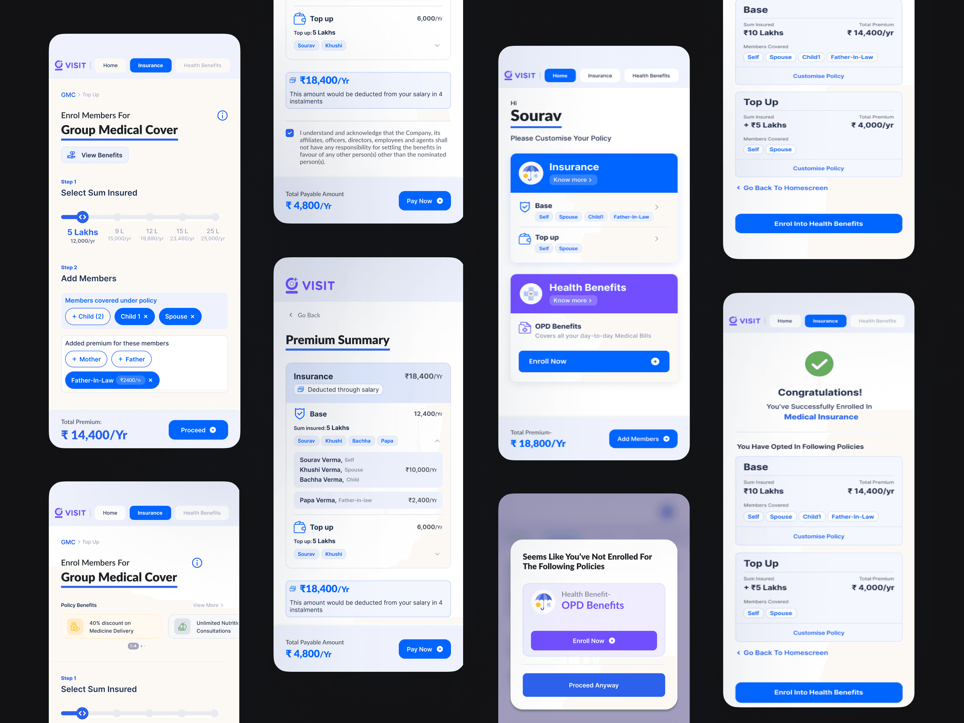
Unified Benefit Gateway: Streamlined the selection process, allowing users to onboard group medical cover and add secondary policies (Accident, Life, OPD) within a single, cohesive flow.
Real-time Financial Transparency: Integrated on-demand access to premium details and dependent summaries, eliminating the "Black Box" of policy costs.
Frictionless Comparison Logic: Replaced dense, multi-page PDFs with user-friendly comparison screens, surfacing key benefits instantly to drive faster, more confident decision-making.
Narrative-Driven Onboarding: Leveraged a component-based design to weave a cohesive "story" throughout the journey, keeping users engaged from login to completion.
Developer-First Workflow: By establishing a robust Design System, I reduced development cycles significantly, allowing the team to meet aggressive launch deadlines with high-fidelity results.

Modular Design
The portal features a modular design that allows for easy customization to meet specific corporate requirements. This enables a more personalized onboarding journey for each organization.
Simplified Onboarding Journey
The portal makes it simple for users to onboard their group medical cover and add other policies like personal accident, term life insurance, OPD benefits, and more, all within a single journey.


Plan Comparison Feature
The new plan comparison screens present benefits in a user-friendly format, eliminating the need for users to scroll through lengthy documents for basic information. This enhances understanding and decision-making.
Real-Time Financial Transparency
Integrated on-demand access to premium details and dependent summaries, eliminating the "Black Box" of policy costs throughout the journey.

Developer-First Workflow
Established a robust Design System that increased development velocity, allowing the team to meet aggressive launch deadlines with high-fidelity results.
Narrative-Driven Onboarding
Leveraged component-based storytelling to keep users engaged, moving away from a "form-filling" task to a guided experience.
The Outcomes
Reduction in user dropoff
24%
Reduction in development time
50%
Increased voluntary policy sales
40%
From behind the scenes
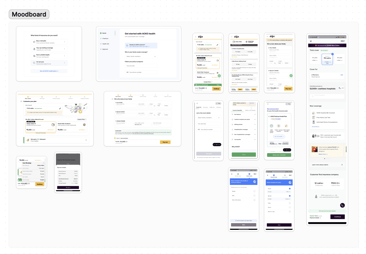
When deadlines are tight, process is everything. I began by architecting a data-driven persona in Figma to ensure every design decision served a specific user motivation. After conducting a targeted competitive audit, I facilitated a cross-functional brainstorming session to align the team on a unified vision. I utilized low-fidelity paper wireframes for rapid iteration and 'fail-fast' testing, allowing us to finalize the structure before moving into high-fidelity design and system building.